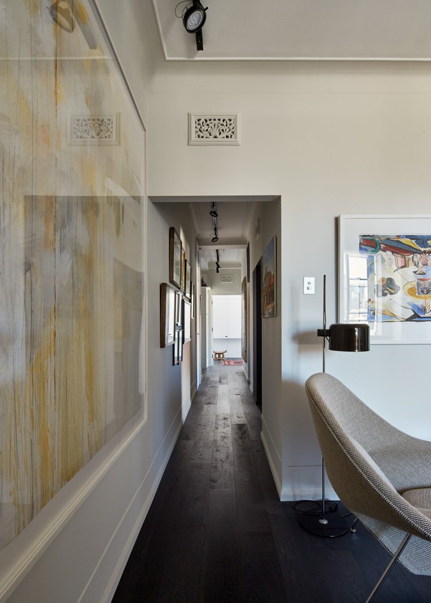
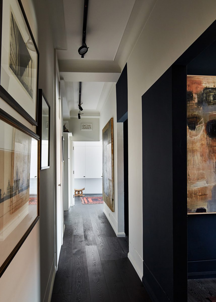
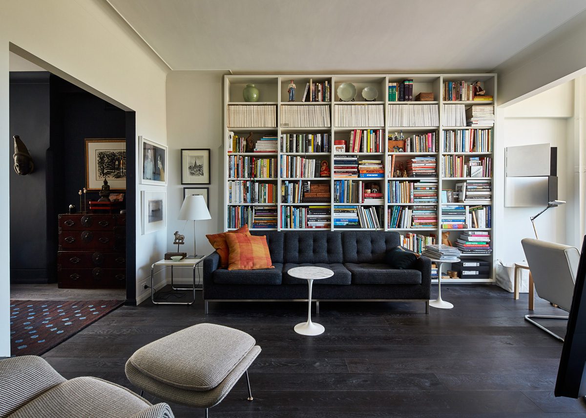
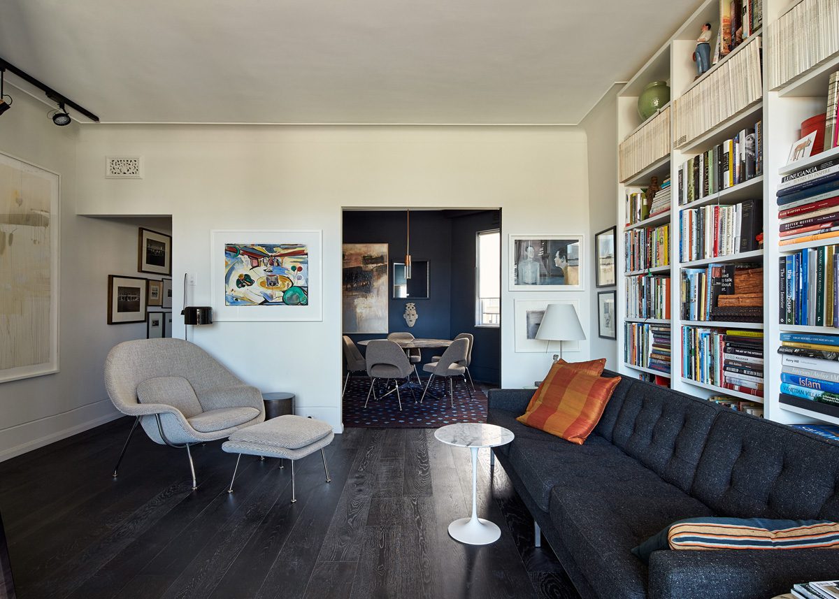
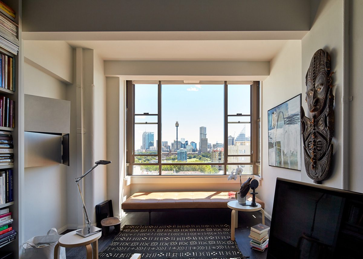
This project continues the clever and innovative consideration of small spaces, that characterizes the work of Stephen Collier Architects. In particular, it shows how it is possible to make better use of the existing space in a cramped and narrow apartment so that the rooms feel bigger and also work better. This is approached with an aesthetic consideration of colour, in the form of space enhancing midnight blue, as well as materiality. It does this by carefully and judiciously cutting into walls. Several key door openings have been enlarged and two new ones of differing size have been made. In the process, the corresponding use of the rooms that these openings now connect, in different ways, has been significantly transformed.
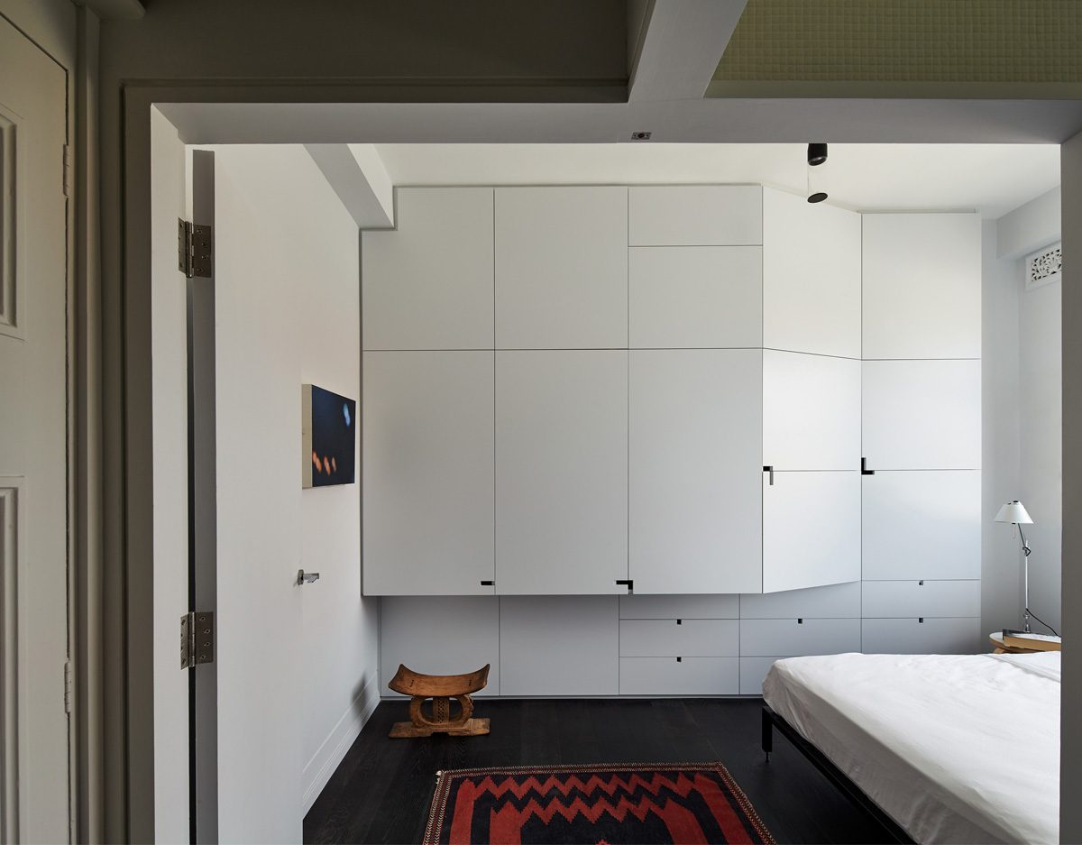
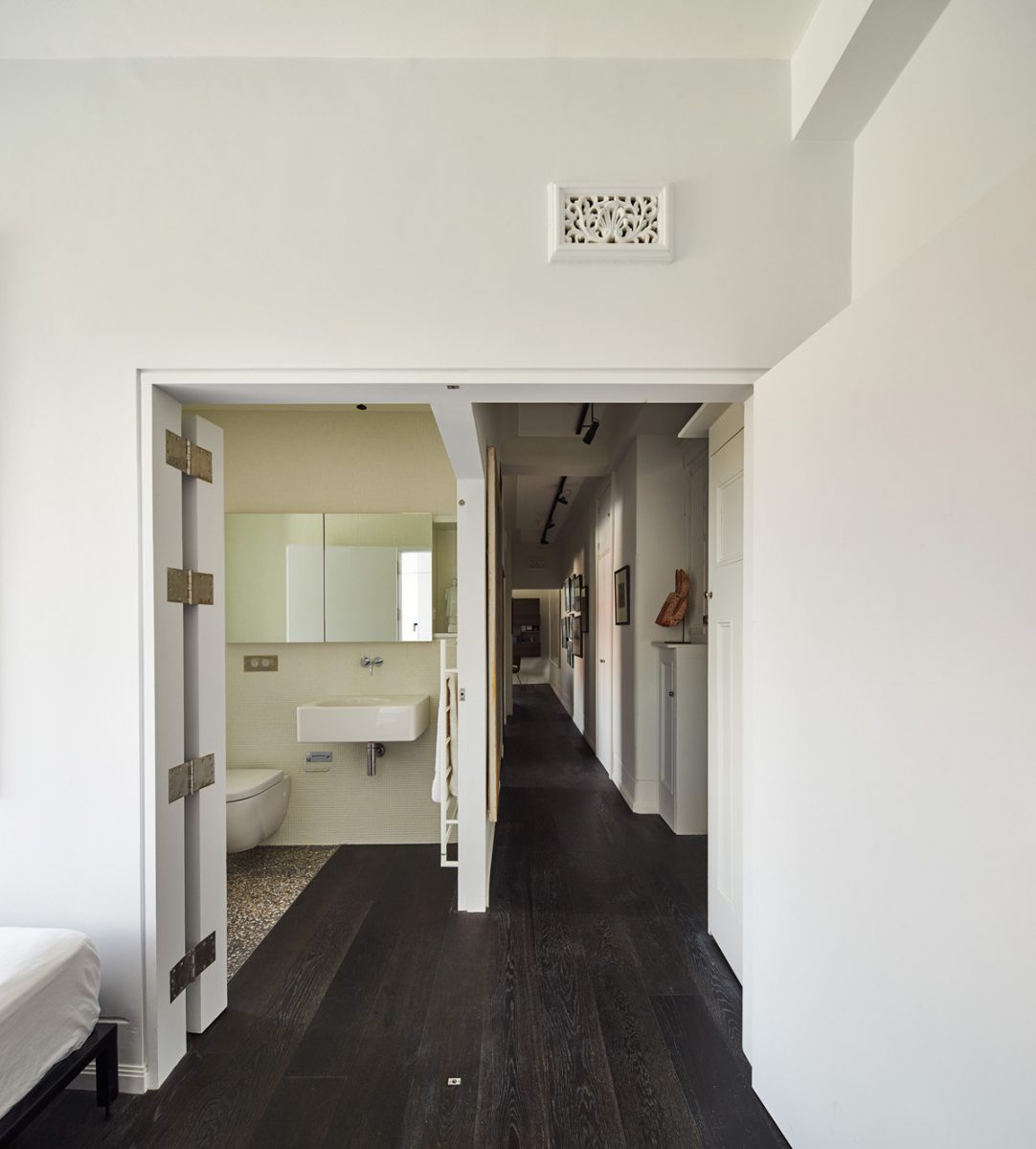
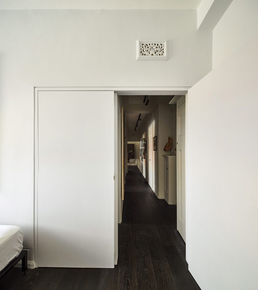
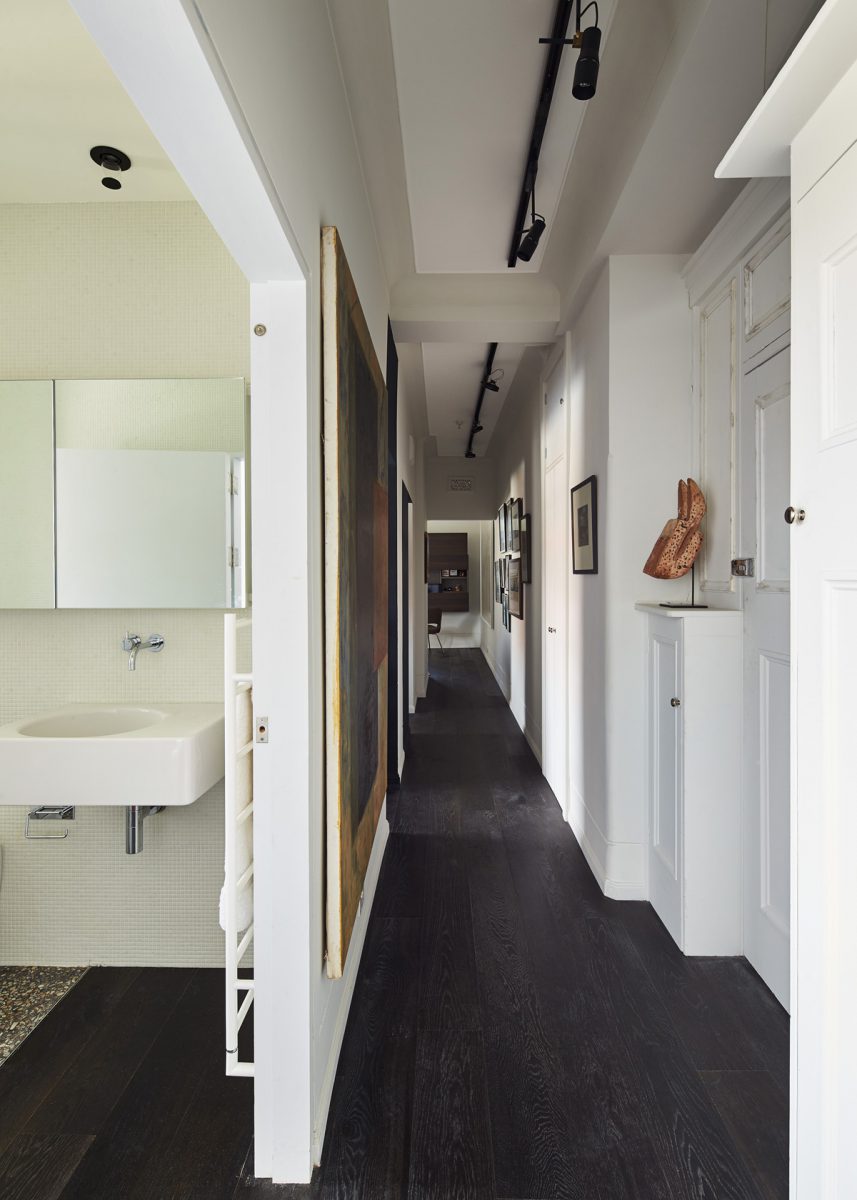
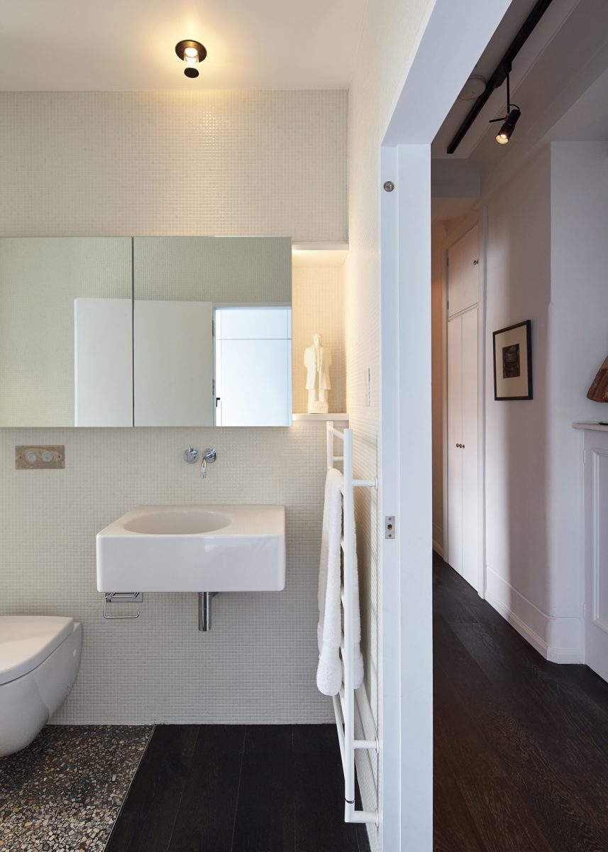
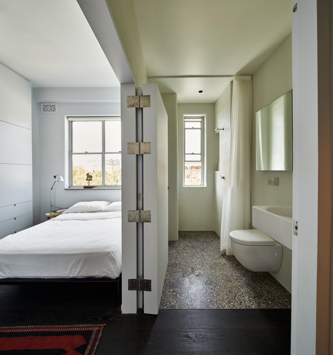
The key to this transformation was to convert a small study beside the entry and bathroom into the main bedroom. Space is borrowed and views opened up between a dark corridor, the small bedroom and an equally small bathroom by making a new T shaped door between these three rooms. This arrangement is made possible by a composite two-panel door that folds back on itself (in one configuration) and also back on the bathroom wall (to form another). This allows all three rooms to connect seamlessly (with the doors all folded back) or for the bathroom and bedroom to be used in a conventional configuration with both doors opening onto the corridor. The resulting configurations allow the spatial form of the original apartment to remain present (as a mark of respect for its heritage) as well as to open up in a modern way. Ample storage is provided along one wall with a wardrobe that hangs out over the floor, at the dressing end, and tapers back to align with the window reveal at the other. The resulting form, allows a double bed below the sill, a front surface that reflects light back into the room, a narrow lower section that enhances the sense of space by maximizing the floor area and also a deeper section of unit above to comfortably fit suits and shirts.
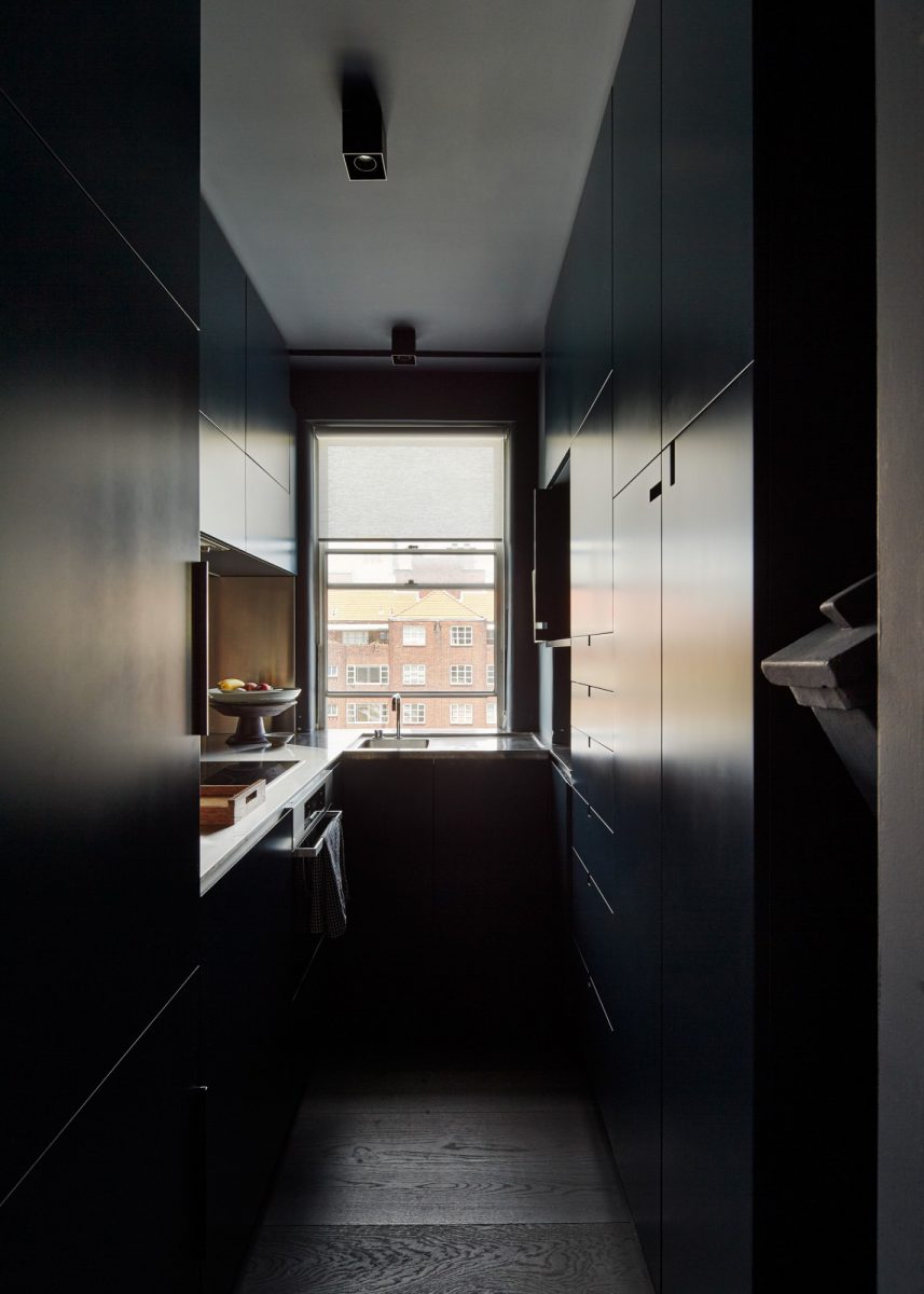
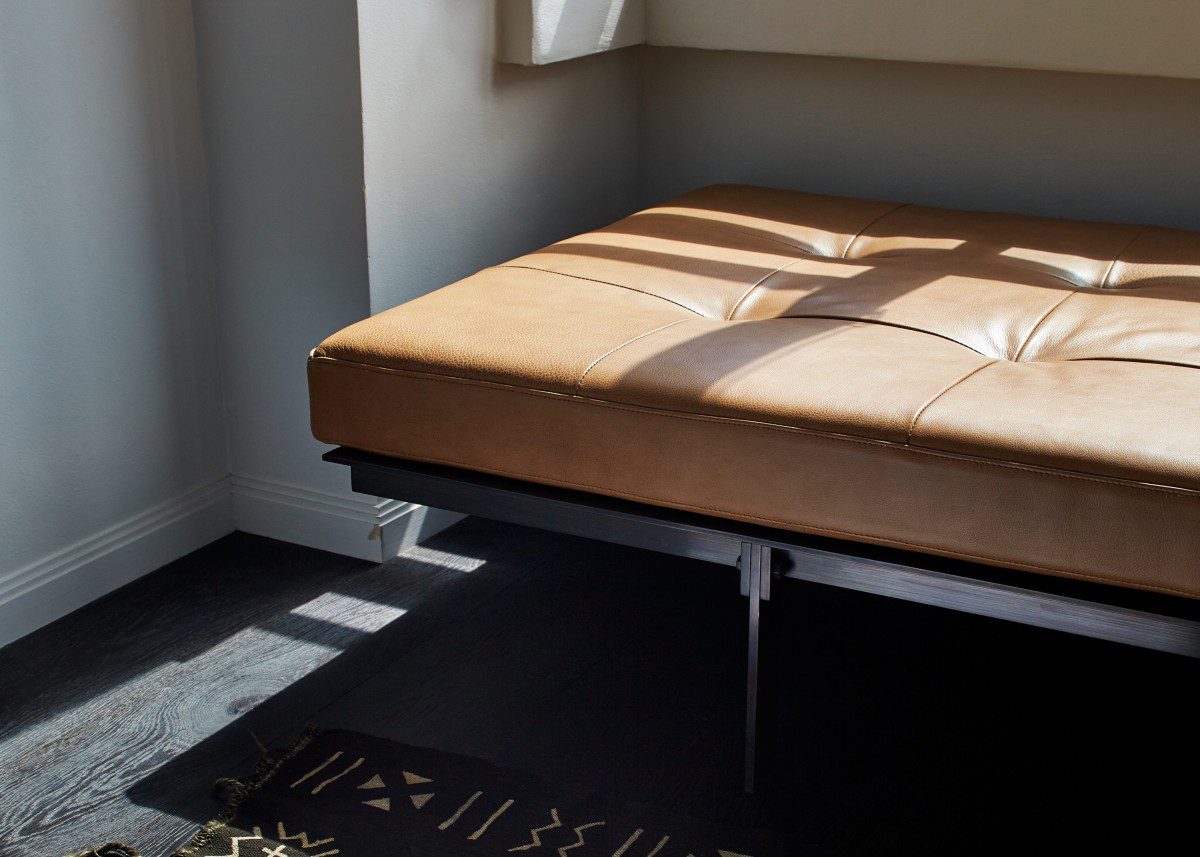
The original bedroom (located in a central pivot point of the plan) was freed up for a new dining room and a much larger living space. A discrete view to the city CBD, from a small kitchen hatch, has been opened up from the kitchen through the dining, living and sunroom. The kitchen with an inbuilt washing machine, is designed like the galley in an airplane. Incredibly tight but functional; a small dark and moody cave. Stephen Collier Architects also designed the bronze and leather banquette which sits in the newly configured sunroom.
This is the second project that Stephen Collier Architects has done for this client. The first was the Elizabeth Bay Apartment.

